Most conversion advice is written for cheap, fast purchases: fewer clicks, bigger buttons, urgency timers. It works for a $25 impulse buy. It often backfires on a premium mattress, a high-end beauty device, a designer light fixture or a precision tool, where the buyer takes days or weeks to decide, visits several times and compares you carefully with alternatives.
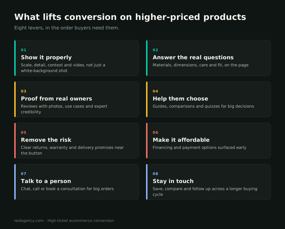
High-ticket ecommerce is a different problem. The buyer isn't short on attention. They are short on confidence. This guide covers the eight levers that move conversion on considered purchases, in the order buyers need them, and how to test them without guessing. It comes from the premium DTC stores our conversion rate optimization team works on across Shopify Plus, Magento and BigCommerce.
How considered purchases differ
- More visits before buying. Many buyers visit several times before they purchase. A session that doesn't convert isn't necessarily a failure; it may be step two of five.
- Bigger fear of a wrong choice. At a higher price, the cost of getting it wrong (wrong size, wrong finish, wrong fit for the room) weighs more than the price itself.
- More research outside your site. Reviews, comparisons, social content and conversations with friends all happen between visits.
- Different metrics. Conversion rate per session matters less than whether visitors come back, engage with guides and eventually buy. Track multi-session behavior, not just last-click conversion.
The eight levers
1. Show the product properly
Buyers can't touch a premium product, so your media does the work. Show scale (in a room, on a person, in a hand), detail (materials, stitching, finish), context (how it's used) and motion (short videos). Include the angles people ask about in reviews and support tickets. For a heritage eyewear brand, lifestyle product photography was the core of the engagement.
2. Answer the real questions on the page
Pull the top questions from customer service, chat logs and reviews, and answer them on the product page: exact dimensions, materials, care, compatibility, what's in the box, how it compares with your other models. Every unanswered question is a reason to leave and research elsewhere.
3. Proof from real owners and experts
Reviews with photos, reviewer details that match the buyer ("side sleeper", "sensitive skin", "vaulted ceiling"), long-term reviews and expert or press credibility all reduce perceived risk. Put the most relevant proof near the price and the add-to-cart button, not only at the bottom of the page.
4. Help them choose
Choice overload is real at higher prices. Comparison tables, "which one is right for me?" guides, quizzes and finders turn a hard decision into a guided one. The goal isn't to push the most expensive model; it's to give the buyer confidence they picked the right one.
5. Remove the risk
Returns, trial periods, warranties and delivery promises matter more as price goes up, and they only work if buyers see them. State them clearly near the button, in plain language, with the details one click away. A generous policy hidden in the footer doesn't lift conversion.
6. Make it affordable
Financing and installment payment options can make a premium purchase feel manageable. Show the monthly amount on the product page and in the cart, not only at the payment step, and make sure the option works on mobile.
7. Let them talk to a person
For large or complex orders, a real person closes sales that a page can't. Live chat staffed by people who know the product, a phone number that's actually answered, or bookable video consultations can be worth far more than their cost on high-value orders. Track which conversations lead to sales.
8. Stay in touch across a longer cycle
Because buyers take time, give them easy ways to save and come back: wishlists, "email me this product," price-drop or back-in-stock alerts, and saved carts. Then follow up with helpful content (buying guides, reviews, comparisons), not just discounts. Discount-first follow-up trains buyers to wait for a sale and erodes margin on your best products.
What to avoid
Fake urgency (countdown timers that reset, "only 2 left" when there are 200) damages trust with careful buyers, who are exactly the ones who notice. Real urgency, such as a genuine seasonal delivery cutoff, is fine.
Don't forget speed and mobile
Premium product pages tend to be heavy: large images, video, 3D viewers, review widgets, financing scripts. Each one can slow the page down, and a slow page undermines a premium brand before the buyer reads a word. Measure real-user speed on product pages specifically, and load media and third-party widgets efficiently. Most first visits are on a phone, even when the final purchase happens on a desktop, so test the full journey on mobile.
How to test changes on a considered purchase
- Measure the right outcome. Use revenue per visitor and multi-session conversion, not just same-session conversion rate.
- Run tests long enough. Longer buying cycles and lower order volume mean tests need more time to reach a reliable result. Avoid calling winners after a few days.
- Start with research. Session recordings, on-site surveys ("what's stopping you from buying today?") and customer service logs usually point to the biggest opportunities faster than guessing.
- Fix obvious problems without testing. Missing information, broken mobile layouts and slow pages don't need an A/B test. Fix them and move on.
Our ecommerce web design team builds product pages around these principles, and our Shopify Plus agency team handles the technical side for premium brands on Shopify. For made-to-order products, we've built things like partial-payment deposits and automated order statuses for Circle Y, which let buyers commit to a custom saddle without paying in full upfront.
Selling higher-priced products online?
Book a free 30-minute assessment. We'll review your product pages and buying journey against these eight levers and show you where buyers are losing confidence. No pitch deck, no obligation.
Book a 30-minute assessmentMore guides for growing ecommerce teams
- Ecommerce migration checklist: your first year after a replatform
- B2B ordering portals: what contractors and retailers expect
- Ecommerce for lab and reagent suppliers, including punchout catalogs
- Selling technical and regulated gear online
- Running multiple brand stores on one platform
- Is your ecommerce platform holding you back? A 10-minute self-check
Frequently asked questions
What is high-ticket ecommerce?
High-ticket ecommerce is selling higher-priced products online, where buyers usually research, compare and visit several times before purchasing. Examples include furniture, mattresses, premium beauty devices, lighting, jewelry and technical equipment.
What is a good conversion rate for high-ticket products?
Conversion rates are usually lower for expensive products than for inexpensive ones, because buyers take longer to decide. It is more useful to compare your own rate over time and track revenue per visitor and multi-session conversion than to chase a generic benchmark.
Does offering financing increase conversion?
It often helps on higher-priced products, especially when the monthly amount is shown on the product page and in the cart rather than only at the payment step. Test it for your products and audience.
Should premium brands use discounts to increase conversion?
Sparingly. Frequent discounts can train buyers to wait for a sale and weaken the brand. Helpful follow-up content, strong proof and clear guarantees usually protect margin better than discount-led campaigns.
How long should A/B tests run for expensive products?
Longer than for low-priced products, because longer buying cycles and fewer orders mean it takes more time to reach a reliable result. Plan tests in weeks, not days, and measure revenue per visitor.